Details & Process

photo editing in illustration
I do photo editing for a variety of purposes, ranging from basic retouching to more involved photo manipulation for pieces of a larger, digital collage. This section breaks down some of my process and exhibits my approach to photo manipulation within my illustrations.
urban decay lipstick advertisements
This is a three-piece series of advertisements for shades in an urban decay line of lipsticks. This is a self-driven project meant to demonstrate my stylistic approach to beauty advertising.
“decadence”
the idea
For this series, I attempted an avant-garde approach to creating a story through color palette, texture, and objects. I drew inspiration from beauty editorials, focusing on a narrative in the image but included a logo and masthead to open it up to use in various advertising spaces.
I created visual representations of names I picked for each shade, making each lipstick individually pop through the energy of its narrative. I covered the eyes of each model to avoid drawing attention away from the lips and to keep the focus of the story on each color and not the models themselves.
In “Decadence,” I utilize a sultry expression, a deep red used with roses and velvet to match the lipstick shade, and golden accents/textures to illustrate the idea of indulgence, luxury, and pleasure. Gold spills from the lips and captures a moment of overzealous gratification.
the top and bottom left images show some of the color adjustments i made in this piece. I color corrected the red lipstick, which had been washed out due to lighting, to its true color.
I also changed the true colors of some objects to better fit in the piece. For example, I changed gold sparkles on the lips to red so as to not overpower the red lipstick.
“innocence”
the editing
A lot of editing goes into my collage pieces, but each project necessitates the most work on a few main elements. The Urban Decay project focuses around these:
Using clipping paths and image masking for each object
Skin touchups
Color correcting
Changing colors to fit the piece better
Improving and cleaning up the makeup
In “Innocence,” I convey a sense of softness, vulnerability, and comfort through warm purples, pinks, and reds. I use images of a rainy day in tandem with “cozy” items (a blanket, book, and coffee) to set the scene of a quiet day inside.
This warm purple follows the trend of adventurous shades outside of the traditional reds and nudes, eliciting memories of being young and playful with a newly formed interest in makeup, hence the name “Innocence.”
“opulence”
In “Opulence,” I use a striking gold, black, and white palette to express extravagance, excitement, and fun. The gold foil and sparkling textures declare, “I live the lavish life,” while the laughter and dominos allude to fun and games. The scene is playful but is paired with black velvet and furs resembling an expensive jacket or scarf.
This jet-black shade sets the scene of a night on the town as a high roller, or simply the life of the party amongst friends. Either way, they’re the eye-catching center of attention.
the edits
The major priority in editing the portrait for “Opulence” was the makeup. After creating an image mask to delete the original background of the photo, I needed to complete the makeup to bring the intended look to fruition and color correct the lipstick.
As can be seen in the original photo, there was a base layer of gold on the skin; I used this as the foundation and finished the makeup with Photoshop. I made the color more saturated and consistent, filling in empty spots and touching up mistakes. I then darkened the lipstick to make the color true to life.
The dominos were another priority. I shot the photos by propping the dominos up at the angles I needed them to be at. I then changed the colors and raised the contrast to match my palette.
lux agape cover art
I’ve worked with singer/songwriter Lux Agape to create cover art for the release of several singles. For each, she gave me a simple concept to work off of, which i interpreted and expanded on.
I worked closely with her to make sure we didn’t stray too far from her initial vision while still pushing the piece to bring it to life.
“call for you”
Lux’s vision for the “Call for You” cover art was a vintage postcard, initially one that consisted entirely of the words with images inside of the letters. Through the sketch process we realized that the square format didn’t work well with that approach, so I searched through more postcard examples and then proposed this alternative.
This new design kept in elements that were initially discussed (color palette, city, the Corvette, etc.) and stuck with the postcard look, but with an image that benefitted from the dimensions rather than worked against them.
detail closeups
All of the unedited photos are stock images that are free for commercial use. The editing and collage work is my own.
Edits: removed people, removed windshield reflection, covered license plate, added shadows/highlights, changed color
edits: image mask to remove background and unneeded elements, added shadows/highlights, changed color
building the city
The city off in the distance is actually comprised of three different photographs. I used image masks on the buildings I wanted and arranged them to create a pleasing composition. I made the color cohesive and added shadows/highlights where necessary.
To create the road, I blended the path from the below stock photo into the desert ground and used digital painting for touchups where needed. I added/adjusted shadows to create a convincing final product.
“trust issues”
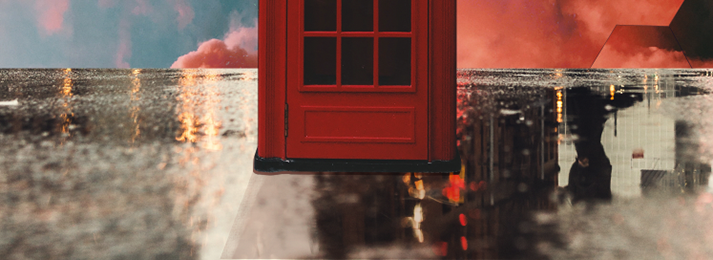
The initial idea Lux proposed for the cover art of “Trust Issues” was a red phone booth in the rain with butterflies flying out and hexagon clouds in the sky. over the course of the project, The palette became increasingly more vibrant, colorful, and heavenly to fit with the song’s theme.
detail closeups
All of the unedited photos are stock images that are free for commercial use. The editing and collage work is my own.
Edits: adjusted color, added shadows and highlights, changed the symbol, straightened bottom text box, changed text
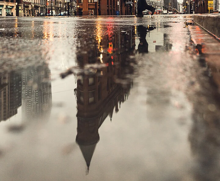
Initial stock photo
placed ground
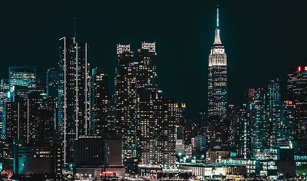
added sky reflection
added phone booth reflection
creating the ground
final with butterflies
creating the sky
The sky is made up of the above three stock photos. I created a cohesive final through blending photos and some digital painting. I then added the hexagon clouds, overlaying them with the same images.
miscellaneous projects
“our father”
The aim of this project was to create a frame for a potential point-and-click game in the spirit of Flash games that dominated the internet in the early 2000’s.
I used the iconic components/imagery of these games, such as distorted photographs that fall into the uncanny valley, dark shadows and rooms that were blocked off, first person perspective, an inventory list, typical horror tropes, etc., combining them into my own story.
I also experimented with simple animation and sound to pair with it, which can be seen here.
edits: color change, shadow adjustment, distort figure to fit creepy vibe
the background of this piece came from a vintage photograph. With my edits, i was aiming for the uncanny valley imagery one would see in these games, distorting things to make them more subtly unnerving.
edits: color change, shadow adjustment, distort hands to fit creepy vibe
Edits: removed elements, darkened shadows to flatten the shapes, cast room in shadow, added tv static
dog whistler
This was a self-driven Editorial illustration for an article titled, "How to Decode Narcissist-Speak.” the article broke down the manipulative language narcissists use, citing specific phrases and explaining what they actually mean when they say it.
[stock photo]
the pieces
this piece was comprised of these three main components. i overlaid the dictionary page on the torn paper, and then edited out word entries where needed for the narcissist-word additions.
i placed the mask behind all of this and hid it in the shadows. i also added a texture to push the contrast and account for the lower resolution of the stock image.
alice isn’t dead
fan art poster
This is a piece of fan art i made for the podcast “alice isn’t dead.” my intention was to create a poster that promoted the show by abstractly summarizing the plot in a single illustration. i focused specifically on the traveling element, as most of the story takes place driving across the country in a tractor trailer.
color was my main focus in editing this portrait. i was aiming to create an illustrative feeling as opposed to a photographic one, in large part to fit it into the simple color palette i was using. i broke apart the head to allude to the way the main character not only brings with her the memories and emotional impact of each place she passes through, but leaves part of herself behind as she changes throughout the narrative.
My digital collage work is comprised of a combination of photography and digital painting. I utilize my own photography as well as stock photos that are free for commercial use. The photo examples above are my own except where noted.
the above pieces are personal works not officially commissioned by the companies featured, except where otherwise stated.


![[stock photo]](https://images.squarespace-cdn.com/content/v1/5e29221c1bc1146fbdde0f12/1606691904019-PY9WWOAHSBTOEVMV73EB/DW_Mask.jpg)